Hey,
I just tested this method [METHOD] Get YOUR best Follow Back Ratio by creating your OWN filters parameters on one of my niche accounts. I used very wide filters when running the accounts. So I analyzed 2 datersets each with ~2,4k users one with poeple that followed back and one that didnt followed back.
They graphs show the amount of people that followed back (Orange) and the amount of people that didnt followed back (Blue) depending on the number of Followers/Followings/Posts/Follow Ratio.
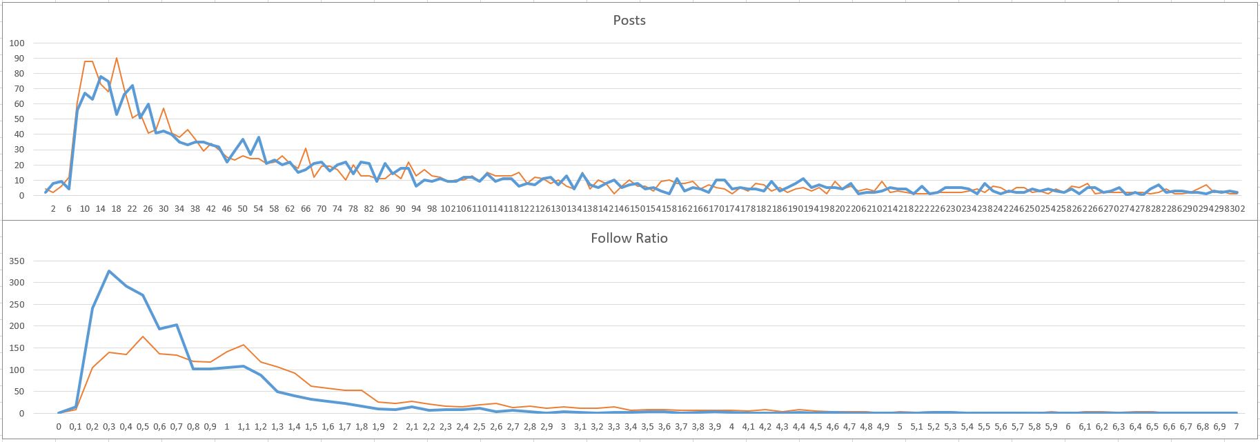
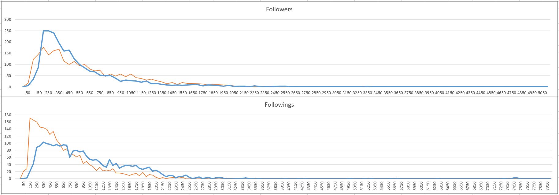
My question now is:
- Woud you use the filters that gave the highest amount of people that followed back or
- Would you use the filters that gave the biggest difference between users that didnt followed back and users that followed back.
So for example with method 1 applied on graph “Follow Ratio” you would try to filter 0,2-1,2 follow ratio.
But with method 2 you would try to filter 0,8-1,8.
Let me know your thoughts about it and keep in mind the amount of users that followed back and didnt followed back in the graphs are the SAME! both ~2,3k
