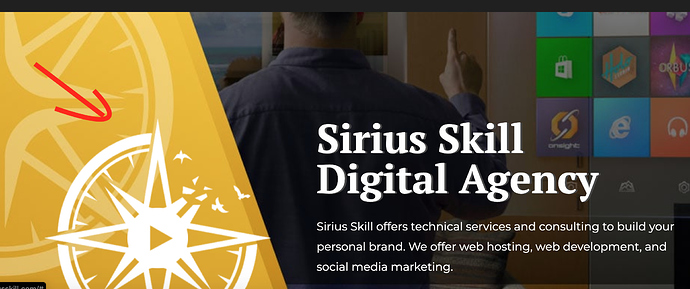
Hey, everyone. I have a website and would really appreciate your thoughts and idea moving forward. I just recently asked a Seo expert for tips and they’re going to get back to me tomorrow. I am going to do minor edits for the site but please I need insight from the people here. I want to make my sight profitable so I can help my family. I am a broke 23 year old, with a fierce determination to make it.
I am going to set up my blog page and woocommerce shop soon and make youtube videos, that is my plan moving forward. However, I would like to hear people’s ideas on how I can make this site profitable. Please parent me on building wealth online. 


Small grammatical error on the landing page should be “We offer web hosting, web development and social media marketing.”
Thank you, I will look into it right away. 
I’m probably not the greatest when it comes to website design and SEO. However a from customer journey angle, i wouldn’t be sure on how to access your services. Maybe a rough pricing page or maybe a very obvious “contact us” page wouldn’t go amiss. Also, i think that you have made of the content on the page just a little bit too personal.
Other than a few edits and adjustments, good job man!
"Photos can be edited and rendered in Photoshop CC. "
“SEO optimization can be done”
There’s an enormous lack of confidence in your copywrite.
Thank you. There are pages I haven’t made public yet because I am still editing but a pricing page, blog, and contact page will be built. 
I am going to make changes to those services. I feel like I sell myself short and that reflects on the serviice being provided. I will make the changes right away. I might replace photoshop cc with something else, and change seo optimization to web page optimization.
I highly recommend you give this book a read and build your website based on the blueprint outlined in it:
Always remember, you are not the hero - your customers are. You are only the the guide.
*Also, there’s no reason to mention you use Jarvee. This is like having customers come to your restaurant and you provide the recipe along with the meal.
Just looked at your website.
none of those are clickable, neither the logo, nor social icons, nor legal ‘text’ buttons. make sure to check this issue 
Lol, I thought I removed those social media logos from the footer. 
Thanks, I will fix those issues right away.
Update: My friend who is a web developer in php is going to give me hand. 
*It is fixed, now I just need to fix up the text on the pages and it’ll be good.
Do you reckon a summary of the blueprint will work just aswell? I’ve got a long reading list 
Congrats for taking the first step…but…
The site and your offers needs a lot of work.
- I would change totally your about page, you added so many things people won’t trust you.
- Remove the web hosting, not related at all with your services.
- Improve the front page, the 6 items you added need to be reviewed, many things you don’t need to say and others don’t make sense, doesn’t look like you know what you are talking about.
Actually that’s my feeling, that you are trying to sell something but I’m not sure what.
Check good development companies sites, also who will hire you to develop a game?
my 5 cents.
Yes, I agree. I need to make my website more tailored to what I am promoting at the moment. If I choose to do other services then I will make a separate website. For example game development. I will make some major changes. Can we can continue this conversation in private messages? I think you make some valid point.
I liked the layout. The site looks good.
Please, make the logo clickable. I tried to click on it everytime 
The logo where? In the footer, I am going to make some major changes to the content on the site but overall, I like the design. It is unique.
the logo in the header
I meant this
Oh that isn’t a logo, but I could make it clickable lol 
brother the site in general is fine. I would change the color of the social icons, since they are white they are not seen well.


