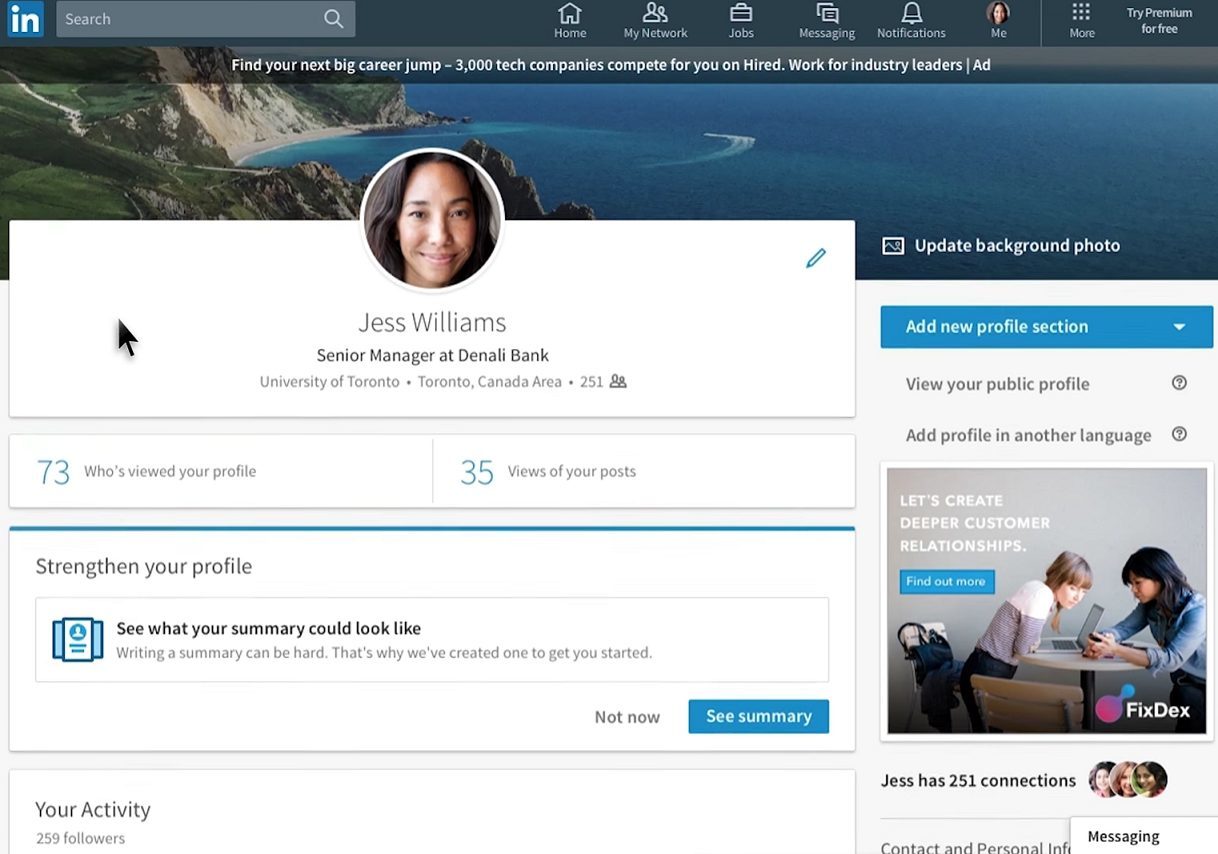
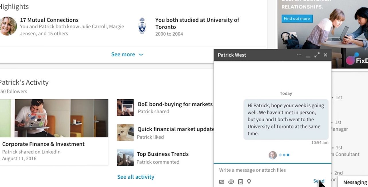
The new LinkedIn website update has got many awing at its new sleek, refreshed and modernized graphical user interface. The makeover has a lot of people gossiping how the new version of LinkedIn closer resembles its nemesis Facebook.
Owing to the fact that the improved LinkedIn interface is a copycat of Facebook, it now has a cleaner, faster and easier to navigate feel. Everything has been changed from the front and back haul, which was long overdue. LinkedIn has not had a massive renovation like this, since it first came on the scene 15 years ago. There is a lot less clutter and new navigation tools to let users have a better LinkedIn experience. The mobile app has also followed in the same route.
LinkedIn wanted to give conversation and content a bigger role to its users and get rid of the graceless product experience LinkedIn was unsuccessfully known for. The employment social network service has built a team of human editors that will zero in on personalization. They will take a look at what is relevant and trending within the user’s company or industry. Also, the new update has made LinkedIn’s users masters of what content they see. Again, just like Facebook, LinkedIn has allowed users to unfollow or hide a post. For the creators of content, the redesign means a blow by blow account on who is reading their posts such as the reader’s company, job title and location. This tool is already available on the app, but will shortly make its way to desktop soon.
Microsoft recently acquired LinkedIn for $196 per share. Therefore, it makes sense that with a big-league shareholder such as Microsoft, a revamp had to be made. The LinkedIn website update first took effect on its mobile platform in December 2015 and was used as a prototype for the site. LinkedIn’s director of engineering Chris Pruett said in a recent interview that he wanted to make LinkedIn simpler and clearer for users to know what they can do on LinkedIn. Also, he added that conversations are easier to make, since they are interlinked within the site and that the overall use of the site is faster and more systematic.
The first feature that will definitely catch your eye when you visit LinkedIn’s new site is the homepage. You can find the link to your profile on the upper left side, your newsfeed now flows through the middle and underneath that is an entry field so you can share articles, photos and status updates. As I said before, LinkedIn is a clone of Mark Zuckerberg’s masterpiece, that’s why you can see on the right LinkedIn has placed trending topics. There is some originality with LinkedIn’s new user face with the addition of a section called “What you need to know now”. This is located above an ad card, which is basically in the same place as Facebook’s ad card.
Now notifications have been centralized. In the past, you would have to view your notifications separately. The updated version allows users to check InMail and invitations in a single feed. Users will only see invitations they haven’t viewed since their last log in, instead of the old way of constantly showing the total number of pending invitations. The navigation bar has got a major facelift and now has seven items: Home (the feed), Messaging, Jobs, Notifications, Me, My Network and Search. There is a section called “LinkedIn Learning,” which offers an immense field of online courses. LinkedIn Learning is accessible through a “more” icon.
In a nutshell, if you like Facebook, you’ll have no problems with the LinkedIn website update. Facebook is still the same place where you can go meet your friends, make new ones, rediscover old ones and chat to all of them, while keeping up with general news and events. The new LinkedIn lets you advance your career, make business connections and build a reputation in a “Facebook” way and that’s pretty cool indeed.
What does this mean to you and how do you think it will change your linkedin marketing strategies?
As for us, let me tell you what it will mean, a lot of headache trying to re-add all the functionality back in MP as this is basically a new platform entirely 


